Both Big Data and Visual Analytics can contribute significantly to improving the quality of health care. A key tenet in quality improvement (QI) is to measure the process where improvement is sought, which can often be a single measure such as time for a patient to receive a specific treatment. However, each data point contains a large amount of supporting information (i.e. a wide dataset), which can include: patient demographic information; patient co-morbidities; time of day that the treatment happened; the specific diagnoses; text-based physician notes; the physician(s) and healthcare professionals that were involved in the care; the prescriptions that the patient was taking; imaging data etc.
This supporting information can account for a proportion of the variability in the measure that is being improved. Through interactive visualization of the measure, a QI consultant or analyst can explore the factors associated with this variability and gain a deeper understanding of possible causality, for example, patients with two or more comorbidities. Comorbidities may have delays in treatment due to extended times needed to ensure a proper diagnosis, or patients that arrive for treatment during off-hours may have delays in treatment because of availability of certain specialists. By applying Big Data and Visual Analytics research, various individuals can explore this wide dataset to understand factors influencing quality of care. Generally, these disciplines can allow for: the development of better QI methods; implementation of more meaningful system improvements by taking out the guess work in the Model for Improvement’s plan-do-study-act iterative cycle (or six sigma’s define-measure-analyze-improve-control process); and the ability to engineer sustainable improvements achieving tightly controlled excellence in health care despite variation in patients and care settings.
The widespread introduction of Electronic Health Record (EHR) systems has revolutionized the ability of clinicians, support staff, healthcare payers, and managers to track, understand, and act on patient and clinical conditions and outcomes. However, healthcare outcomes and the success of initiatives meant to improve them remain inextricably bound to the adoption of effective clinical workflows and the proper use of electronic tools, both of which are difficult to measure using standard EHR indicators. Visual analytics suite that allows clinicians, administrators, and managers to easily view and investigate clinical workflows and behaviors using HIPAA-mandated audit tracking built into their EHR systems, is needed to associate clinical activity with patient outcomes and operational indicators. With this information, participants in the healthcare ecosystem at all levels can play a role in improving clinical effectiveness, increasing patient and provider satisfaction, reducing medical costs, and improving patient outcomes.
Topics of interests that Visual Analytics can help with include, but are not limited to:
- Visualization of Public Health data
- Exploration of Longitudinal Clinical Trial Data using Visual Analysis
- Electronic Health Records (EHR) investigation with Visual Data Mining
- Prescriptions Drugs and interactions Visualizations
- Improving Operating Room (OR) workflow with Visual Analytics
- Outcome Forecasting and Prediction
- Visual Analytics for Patient Safety
- Visual Analytics in Surgery / Radiology / OR / Emergency Room (ER)
- Visual Analytics for Improving Patients Understanding
- Clinical dashboards
- Data Summarization of Clinical Records
- Visual Data Fusion
- Visualization and Analysis of Biomedical Ontology.
- Visualization of Big Data in Healthcare.
Amassing sophisticated data is only half the challenge. To drive improvements in quality and cost, analysis and interpretation must be optimized. Fluent Analytics helps you do it with proven analytics, root cause identification, and performance metrics including:
- Retrospective and prospective medical cost trend analyses, benchmarking, and predictive modeling for targeting patient conditions, safe treatments and behaviors.
- Population segmentation for the clinical and business user with interpretation of clinical and financial risk analysis.
- Provider profiling that measures quality of care and cost efficiency.
- Identifying patient-specific gaps in care and assisting with next-step opportunities for improvement and measuring expected financial effect.
- Bundled payment analytics.
- Analytic results interpretation to assist executives, managers, and clinicians in finding opportunities and driving improvements.
- Reduce medical errors with instant access to aggregated data on diagnostic information.
DIAGRAM 1
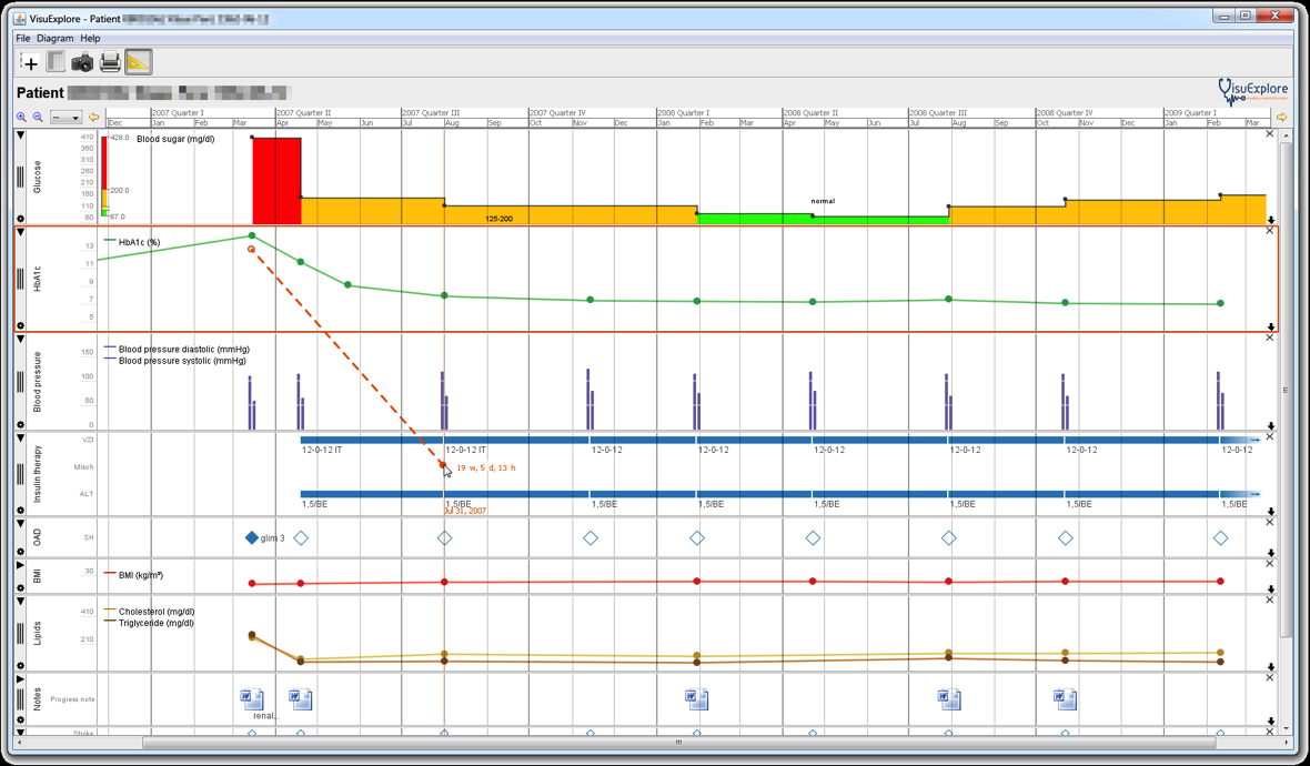
Fluent Analytics can help you apply Visual Analytics in a practical manner, as depicted in diagram 1 above. As per our vision, what we see above is one patient’s parameters (i.e., the health condition of the patient) in tight combination with the applied treatment actions:
Monitoring the treatment progress (i.e., which treatment action is being applied at the moment, which treatments have been applied so far, and which actions may be applied in the near future; red, orange and green chart, respectively)
- Monitoring the overall success or failure of applied treatments (green line below red, orange and green chart)
- Seeing the effects of different treatment actions on the individual patient’s condition (solid blue lines and bar chart on it in the middle)
- Getting a comprehensive/ aggregated picture about the possible reasons for changes of the patient’s condition (i.e., the bettering or worsening of single patient parameters); the red line below the solid blue line where a red dot shows treatments applied. This red line has two less data points than the green line above.
- Identifying sub-optimal treatment choices, and thus, optimizing treatment for individual patients (two brown lines, where top brown line projects better outcomes from treatments over the time).